Mapping Clouds with Meteograms
A daily pixel map of the sky.
Every morning, the India Meteorological Department publishes a meteogram for each of its ~1,200 weather stations. It is a 10-day forecast broken into three-hour intervals and stacked into vertical panels for temperature, humidity, pressure, wind, cloud and rain. When you read these panels together, you can see both the weather you might experience that day and the conditions that make it possible. This is because changes in one panel, like cloud cover, usually cause changes in another, like the chance of rain.
A daily graphic like this is made by each weather station, and some of the bigger cities, like Mumbai and Delhi, have more than one station that predicts the weather. However, as they are only forecasts, the weather on that particular day may differ, and the forecasts become less precise over time.
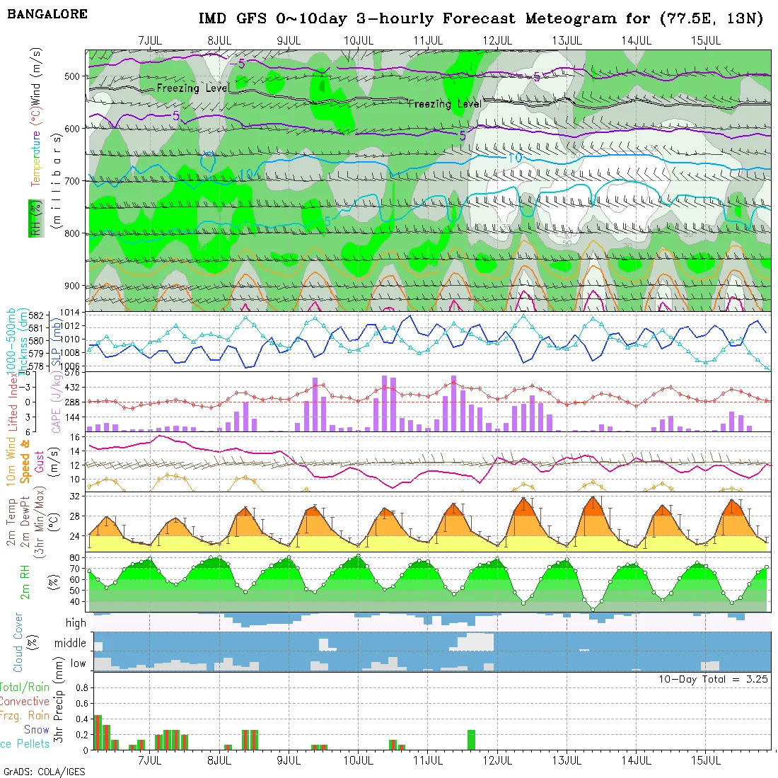
What first drew me to these charts was the density of the visual organization, which you rarely see in the data visualization we usually come across in our daily lives. But the detail that caught my eye was the cloud-cover panel. Look closely, and you can see it is drawn to resemble an actual cloudy sky!

The cloud-cover panel is a stacked histogram split into three tiers: low clouds (cumulus, surface to 2 km), medium clouds (altocumulus, 2 to 7 km), and high clouds (cirrus, above 7 km). When a block of time is fully white, the station expects close to 100% coverage at that altitude.
I love this visualization. It’s charming that the person who wrote the software took complicated weather data and made it look like cloudy, fun pixel art. Every day since February 2026, I have been archiving these charts. I wrote a script that reads the pixels and turns the histogram images back into structured data, so I could plot a given slice of time onto a map. The mapping of India’s clouds at the top of this page is the result of that daily collection and analysis.
What does this percentage value next to each altitude mean? Meteorologists measure cloud cover by dividing the visible sky into eight equal slices, called “oktas.” When the reading is 40%, which means that clouds cover about three of the eight slices, and we say that it is “partly cloudy.”
Interactive sky window. High clouds cover 15%, middle 10%, low 35% of the sky — a ground observer would call this partly cloudy.
With several months of data, some patterns start to show. Every station here has a ‘twin’, or a distant station whose skies get cloudy and or clear in similar ways.
Below are 536 of these stations, ordered from clear to cloudy. You can look up a station to see how cloudy it has been over time and today, and to see which faraway station the sky looks most like.
Methodology
We extract daily cloud coverage data by analysing meteograms for each weather station. Because the charts use a standard layout, we could isolate the cloud-cover section and sample 80 evenly spaced intervals across the timeline. The chart divides the sky into high, middle, and low altitude layers, representing cloud density with the height of white shading. By measuring how high this shading reaches in each band, we calculate the percentage of cloud cover. To an observer on the ground, the sky looks overcast if even one layer is full, so we define a station’s overall cloudiness using the highest percentage among its three recorded layers.

Reading pixels from one chart can only get so close, so we check our numbers against other sources. The rain on the map comes from the IMD’s own numeric forecasts, which we also use to catch and correct bad pixel readings. To keep track of today's sky in real time, the map is continuously updated with live observations, including cloud coverage from EUMETSAT's Meteosat-9, cloud-top temperatures from IMD's INSAT-3DR and 3DS satellites, and ground-level oktas reported by IMD observers. However, past days remain forecasts and are not corrected.
Finally, to match distant stations with similar weather trends, we tracked how each station’s daily cloud cover shifted compared to its average, pairing locations at least 400 kilometres apart whose skies cleared and clouded similarly.
Data and code for this project is available for reuse on our Github.
AI Declaration
No prose was written by AI. Nor were any graphics generated. For example, the cloud glyphs on the map were drawn pixel-by-pixel into ASCII Draw Studio and then rendered here. The author did use Claude for coding help, so the internal logic, algorithms, and the scripts that turn charts into data and then the data into charts again may be partly LLM-written.
A Diagram Chasing Production
This project is independently produced and reader-supported. Consider sending a tip so we can keep making work like this.
₹ Support us